Scope
Packaging Design, Branding, Color Strategy, Graphic Design, Product Marketing
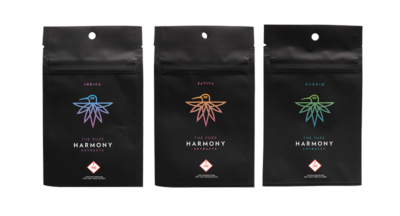
Project Description
Redesigned Harmony Extracts’ mylar packaging to elevate their previous black, minimal designs into vibrant, eye-catching packaging. Each cannabis dominance strain (Indica, Sativa, Hybrid) was given a distinct color while maintaining the signature brand swirl pattern and emphasizing the company logo. The goal was to create packaging that not only stood out on shelves but also clearly communicated strain type and reinforced brand identity.
Outcome
The redesigned mylars became visually striking and instantly recognizable, helping customers quickly identify strains while elevating the overall brand presentation. The bold, colorful approach increased shelf appeal and strengthened brand cohesion across product lines.
Problem Solved
Previous mylar designs were understated and failed to capture consumer attention or differentiate strain types effectively. The redesign addressed this by combining a strong color strategy, consistent branding elements, and clear visual hierarchy, resulting in packaging that attracted attention, communicated product information, and reinforced Harmony Extracts’ premium image.