Scope
Packaging Design, Branding, Graphic Design, Product Marketing, Illustration
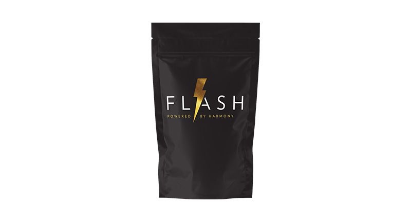
Project Description
Redesigned Flash Mylar packaging to make flavors the central focus, creating vibrant, attention-grabbing designs that encouraged customers to explore the full range. Each flavor was highlighted with its own distinctive color, bold graphics, and custom icons or illustrations representing the flavor profile. The goal was to make the packaging visually pop on shelves while maintaining brand consistency and appealing to both new and returning customers.
Outcome
The redesigned mylars successfully drew consumer attention, making it easy to distinguish between flavors and enticing customers to try multiple options. The use of playful, illustrative icons paired with bright, bold colors elevated the brand’s shelf presence and reinforced its fun, approachable personality.
Problem Solved
Previously, Flash Mylar packaging did not clearly emphasize flavors and struggled to stand out in a competitive retail environment. The redesign solved this by creating visually striking, flavor-focused packaging that improved customer engagement, enhanced product discoverability, and strengthened overall brand identity.